Bottom Weighting Art

To Bottom Weight or Not To Bottom Weight – there seems to be many strong opinions on this topic amongst framers.
Let’s look at where this “rule” of matting originated. During the 19th century, rooms in homes had high ceilings. It was the fashion at the time to hang framed art high up on the wall. For a time, it was even fashionable to hang the art tilted out from the wall on a long wire so when someone was looking at it from below they could better see it. When viewed at that angle, however, the framing appears to be out of balance. The top of the frame is more prominently exposed than the bottom. Thus – bottom weight was born.
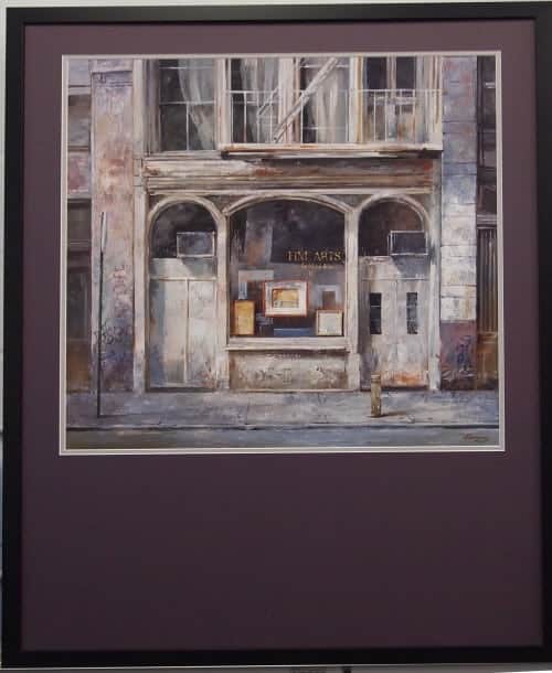
We tend to be more practical. Our client loved this art piece and needed it to fill a space much larger than the art – thus the bottom weight of the mat was decided. (by the way – they also loved this mat color – it wasn’t available in oversize so we printed it for them – exactly the color they wanted!)
When a title or signature appears below the image, a small window may be necessary in the mat’s bottom border. This will, of course, require the mat’s bottom border to be wider.

Thanks to Archival Methods for this explanation
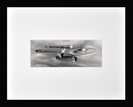
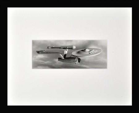
Using the same image of Star Trek’s iconic Enterprise – and the exact same sized mat windows – here are examples of a “centered” mat window on the left / a “weighted” mat window on the right. While the top and bottom borders of the “centered” mat on the left are absolutely identical, the image might look a bit “low” to some people (while not to others). This is an optical illusion, and can be corrected if one choses to “weight” the bottom border of the mat as illustrated in the photo on the right. This option to “weight” the bottom of the mat is fully explained below.


You may think that every window cut into every mat should be located in the exact dead-center of the mat. While this may make “logical” sense, it often doesn’t make “visual” sense.
When an image is “centered” in the exact middle of the mat, sometimes the image may appear to look a bit “low,” as if there is less of a mat border on the bottom than there is on the top. This is an optical illusion, but it can be visually distracting to some people.
In order to counter this, window mats are quite frequently “weighted” at the bottom, which means that the same size window opening as measured for a “centered” mat is cut, but this window is “moved up” slightly so that the bottom border of the mat is just a bit wider than the top border. This “weighting” of the bottom border counteracts the optical illusion sometimes seen in “centered” mats, and therefore the placement of the image within its mat borders seems “visually correct.”
So – as most things in the art world – the “right and correct” thing to do is subjective and based on aesthetics. We like to know and share the ‘rules’ – and then you can decide how you want to move forward with your artwork.

